Creative Brand Guide
Creative Brand Guide
Brand Assets
2024
The ultimate resource for the visual and stylistic elements that are used to represent Creative Imaging Services. This interactive guide is designed to articulate our brand identity through its core components: logos, typography, and colors. Whether you are creating digital content, print materials, or crafting presentations, this guide will ensure you represent our brand consistently in any environment.
Introduction
Welcome to the definitive guide for representing Creative Imaging Services. This resource is designed to ensure consistent and effective use of our logos, typography, and colors across all media. Whether you're designing for digital, print, or presentations, this guide will support you in maintaining our brand's integrity.
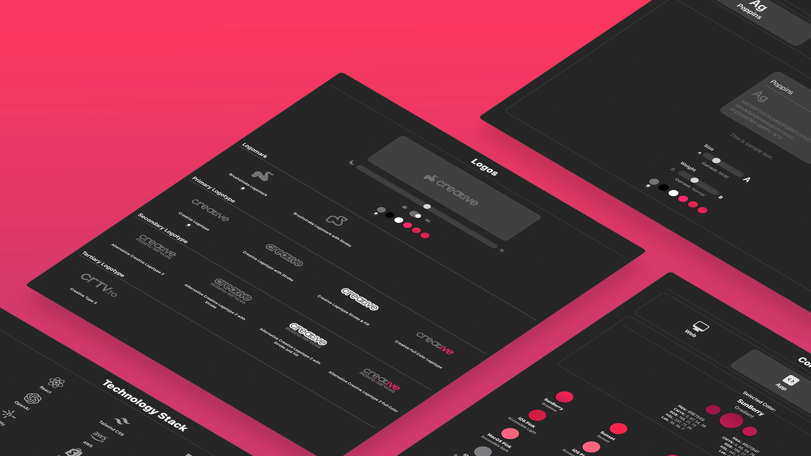
Logos
The Creative logo is designed to encapsulate the essence of the brand through two distinct but interconnected components: the Logomark and the Logotype. Each plays a crucial role in brand recognition and representation, tailored to fit various uses while maintaining a cohesive brand identity.
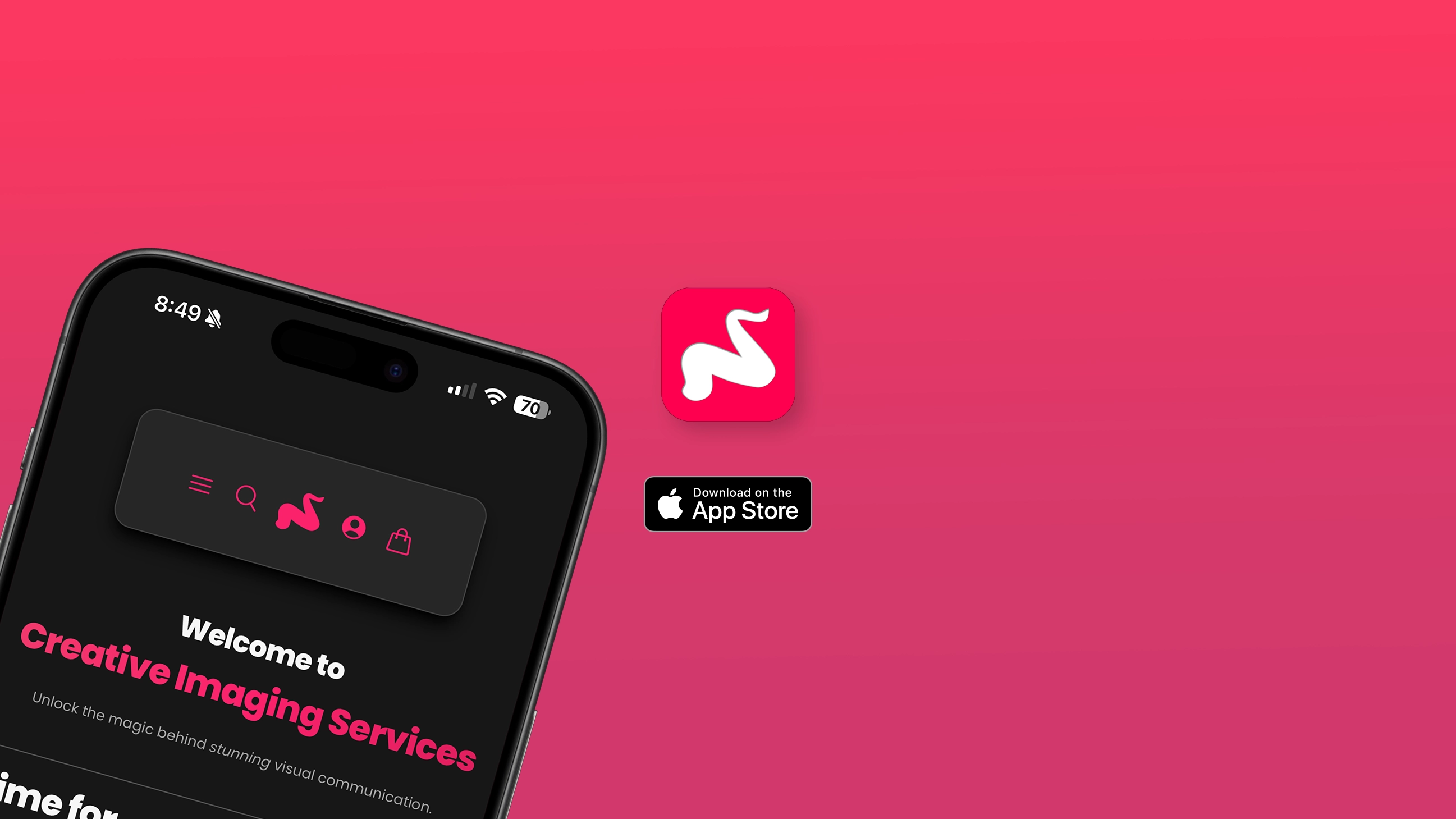
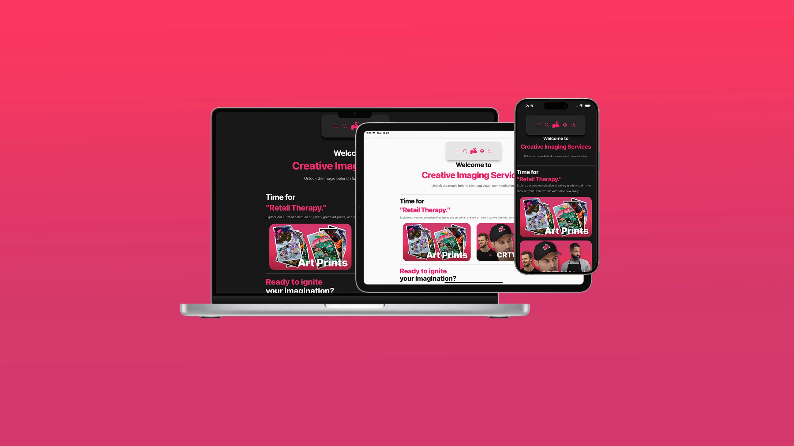
Logo Tool
Explore the adaptability of our "Brushstroke" logomark and logotype against different backgrounds and in various contexts. This tool helps visualize how our logos look under multiple conditions, ensuring versatility without compromising on brand recognition.
Logomark
Our primary logomark is the cornerstone of our visual identity and should be prominently displayed in most brand communications. It is critical for conveying the authenticity and essence of our brand. The Logomark is a symbolic representation of the brand, used for instances where space is limited or where the brand identity needs to be recognized instantly without the use of text. It typically features distinctive graphical elements or icons that are easily identifiable and can stand alone without the accompanying text. The logomark is particularly effective in social media avatars, app icons, and other mediums where a concise visual representation is essential.
Guidelines:
Standard Application: Follow the clear space and alignment guidelines to maximize visibility and impact. The logo should always be surrounded by sufficient whitespace, defined as the height of the 'C' in the logotype.
Size Specifications: Never scale the logo to less than 30px in digital media or 0.5 inches in print to ensure legibility and integrity.
Incorrect Usage: Avoid altering the logo's colors, skewing proportions, or adding any effects that may distort the logo.
Logotype
The Logotype is the textual component of the brand logo. It consists of the brand's name in a specific and custom-designed typeface. This part of the logo emphasizes the brand name through stylized text that complements the logomark, enhancing the overall aesthetic and brand recognition.
Our logotype comes in primary, secondary, and tertiary forms, each tailored for specific communications and mediums to enhance brand flexibility without diluting identity.
Primary Logotype
Used in all official documents and primary brand communications where the Creative Imaging Services brand is established and the "Imaging Services" tagline is inferred.
Usage Examples and Best Practices
Do: Ensure the logo is clearly visible against the background. Use contrast effectively.
Don't: Overlap the logo with other graphical elements or text that may impede readability.
Secondary and Tertiary Logotypes
Our secondary logos provide flexibility for different contexts and mediums. Each variation respects the core identity of our brand while adapting to specific uses.
Secondary Logotype: Suitable for co-branded materials where the primary logo does not fit seamlessly, or when "Imaging Services" must be included specifically.
Tertiary Logotype: Ideal for informal or internal communications, subdomains, and for specifically calling out the website separately from the brand as a whole.
Variations
In order to support a large variety of background materials, some style variations have been provided on each of the logotypes (as well as the logomarks, to match.)
Stroke
For appropriate situations, like matching other vendor icons or page styling, a stroked or outlined version of our logomark and logotypes is available for use.
Stroke and Fill
For dark backgrounds with dark fills, this variant allows for a constant white stroke so that a secondary color can be applied as a fill.
Full Color
A variant with a splash of our primary color to make it pop. This a duo-tone design and the SVG code accepts the currentColor property on the parts of the image that can be black, white, or gray while retaining brand pink in the rest of the type.
Typography
In our brand communication, considerations must be made for readability and accessibility but also for setting a tone and creating an emotional impact.
Typography Tool
Preview font variations in the tool below to see samples of our typefaces in various widths and colors.
Primary Typeface
Our typefaces are a cornerstone of our visual identity, contributing to the legibility and personality of our communications.
The primary typeface should be used to convey most of the textual information in communications. It is designed to be versatile and readable across sizes and mediums.
Guidelines:
Style and Weight: Choose weights between 400 (Regular) and 700 (Bold) for body text and headlines, respectively.
Best Practices: Maintain line spacing of 120%-150% depending on the size and weight to enhance readability and aesthetic appeal.
Secondary Typeface
Our secondary typeface provides a backup option when the primary typeface is unavailable for use, in certain e-mail clients and web browsers and other contexts where a fallback is required and can't be specified, a similar system font may be used.
Tertiary Typefaces
Our tertiary typefaces, such as Platypi shown above, complement the primary typeface, providing variety and emphasis where needed without overshadowing the primary typeface.
Guidelines:
Use the tertiary typeface for pull quotes, captions, or to highlight important snippets of information.
Never use more than two different typefaces in the same document to avoid visual clutter.
A fallback system serif font may be used if the font will not load.
Color Palettes
Colors are crucial for maintaining the visual coherence of our brand across different platforms and materials.
Color Palette Tool
Use our interactive tool to see our real time color converter library to see the care and effort used to provide the most accurate reproductions.
Web Colors
Our primary colors define our brand personality and should be used prominently in all our brand materials.
Guidelines:
Color Specifications: Adhere strictly to the HEX, RGB, and CMYK codes provided in the guide.
Usage: Balance color usage to avoid overwhelming the visual presentation and maintain accessibility standards, particularly in contrast ratios.
App Colors
These system colors provide additional flexibility and variety while complementing our primary palette.
Ensuring color usage meets accessibility standards for inclusivity and text contrast was a top priority in the development of the CRTV Shop App. Apple's System UI colors help to accomplish this and are primarily used whenever possible to retain excellent readability in dark or light mode.
Print Colors
In our high fidelity print materials where color accuracy is critical, such as marketing brochures and official merchandise, colors may be adjusted in order to provide an accessible and visually appealing design. This may include some margin of error when converting color values.
Copic Color Palette
The Copic color palette is based on the Copic marker system, which is a brand of refillable markers and related products made in Japan. Copic markers are highly favored among artists, designers, and hobbyists, especially those involved in illustration, design, and manga art. They are appreciated for their high quality, reliability, and the vibrant, consistent colors they produce. The color system integrates with Copic's library to produce fantastically accurate reproductions in a variety of media formats in both print and web use.
Software and Tools
Our technology stack is curated to support robust and scalable solutions that adhere to modern development standards.
Resources
Download all necessary brand assets to ensure that every piece of content you create aligns with our brand guidelines. These resources are intended to streamline the design process and ensure consistency across all materials.
Downloads
Accessibility
Ensure that all designs meet accessibility standards to cater to all users without discrimination. Utilize tools to check color contrast, readability, and navigational ease to maintain an inclusive brand presence.
By adhering to these detailed guidelines, stakeholders from various disciplines can confidently apply our brand assets, preserving the integrity and intention behind our brand's visual identity.
Contact Us
For further inquiries or special requests regarding our brand guide, please reach out to our brand team here.
Interested in working with Creative?